When i sent this questionnaire out to people i was hoping for certain feedback. Luckily i had received my questionnaires back with all the answers i wanted. Whether this was because i handed them out to people my age or it was just their opinion, im not sure of.
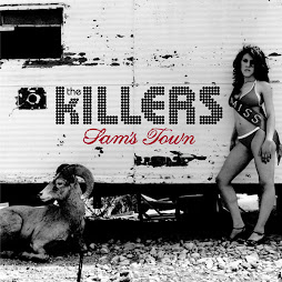
For the first question which was "what genre of music are you interested in?" many answers came out as Rock and Pop. These are very popular with young people knower days, especially pop. R&B and dance did not come up much, which i found quite surprising because R&B seems to be quite popular at the moment. The second question was "Do you attend any festivals or concerts? if so which ones?" Many of the answers were T4 on the beach, which plays alot of pop music and a very obvious one, Glastonbury. Which plays most genres of music. I might include an advertisement on my front cover for Glastonbury seeing as it was so popular in my questionnaire. Question three was "Who is your favourite artist? (preferably alternative/indie) you may list more than one." The reason i gave a genre of music is because this is the genre of my magazine and i think it would help me more if i had a set of artists in the same genre. I also gave them the option of listing more than one because it is relatively hard to name only one artist that you like. The Killers were the most popular answer, but other than that it was quite varied. With different answers such as MGMT, Coldplay and Snow Patrol. Question four was "What part of magazines do you favour?" This is one of the important questions because i need an idea for my article. Interviews and reviews were the most popular. News was not chosen at all, i think this is because i handed the questionnaires out to sixteen-seventeen year olds and they are more interested in interviews of artists than news. Question five was "What colours would you relate to indie/alternative music?" This question is slightly different to the other questions. It is more specific in the front cover. Black was the colour that came up most, but along with grey and white and even burgundy. I think i will take this with me into my house colours. I like black and grey but i think i need a bit of colour to go with them. Question six was "What would you say is the most popular genre of magazine?" This question is just to make sure i have made the right desicion in my genre of magazine. Many people wrote Pop and Rock/Indie. I am really happy with these answers because as long as rock and indie are included thats great. Question seven was "what would you say makes a good magazine?" Although this question is a bit general i think that a questionnaire needs this in order to get peoples views. Many of the answers included the front cover as the most important part of a magazine. Which is quite fair because this is what makes people buy the magazine. Others included good artists, interviews and an interesting one, the brand. Some brands are obviously more popular than others. Question eight was "Do you play any musical instruments? If not now, have you ever played any? OR if you wanted to play an instrument what would it be?" I added a few other ways of answering this question because not everyone would play an instrument, but some people have previously or want to play an instrument. I didnt have a certain amount of the same answer to this question unfortunately. Most of the answers were people who wanted to play an instrument, but never have. These were drums, electric guitar and even the flute! Only two answered that they played the electric guitar. The reason for this varied response could be the people i handed the questionnaire out to, i didnt vary the types of people. I handed them out to one group of friends and same age. Question nine was "Is there anything new you would like to see in music magazines?" I like this question because it is quite general like question seven and gets more of peoples thoughts. Again, the answers were varied but were really helpful. One said that they wanted more detailed information about festivals, i agree with this because when reading a music magazine, they dont give all the information you need. This is something i might use in my project. 'an original style of front cover' was an interesting answer. Obviously this is what i want to achieve, i want to make my front cover as original as i can, to an extent. Finally question ten "What would attract you to a magazine?" I was quite proud of this question! Mainly because this is what is most important about a magazine. Magazines need to know what readers want in order for it to be sold. I gave them the option of Front cover, Artists, Features and Competition/Freebies. I guessed that most people would say the front cover or artists and i was right. No one said features surprisingly, but they were either artists or front cover. So i know what things to work on more than others.
Overall i am satisfied with my results. Most of the answers were what i wanted, but there were some answers i was surprised with. If i could change anything i would change one or two questions to make it much easier for people to answer. Such as the musical instrument one. Although i did get enough information from people to help me with my project!
Thursday, 26 February 2009
Week 5...Questionnaire...
I am studying Media Studies at A level. I am doing some research on what people would like to see in a music magazine. I would be grateful iff you would spend some time filling in this questionnaire. Lydia Bowden
Age:
Gender:
1) What genre of music are you interested in?
…………………………………………………………………………………………..
2) Do you attend any festivals or concerts? Iff so, which ones?
…………………………………………………………………………………………..
3) Who is your favourite artist? (Preferably alternative/indie) you may list more than one.
…………………………………………………………………………………………..
4) What part of magazines do you favour? (Please circle)
Reviews Interviews Features News
5) What colours would you relate to Indie/Alternative music? You may list more than one
…………………………………………………………………………………………..
6) What would you say is the most popular genre of music?..............................
7) What would you say makes a good magazine?
…………………………………………………………………………………………..
8) Do you play any musical instruments? Iff not now, have you ever played any? OR Iff you wanted to play an instrument, what would it be?
…………………………………………………………………………………………..
9) Is there anything new you would like to see in music magazines?
…………………………………………………………………………………………..
10) What would attract you to a magazine? (Please circle)
Front Cover Artists Features Competitions/Freebies
Thank you for your help and time. Your information will be confidential.
Sunday, 22 February 2009
PHOTOSHOPPED PHOTOS


These are some of my favourite photos i have photoshopped. I just wanted to play around on photoshop to practice and see what i can do with the photos. The black and white is quite an artistic effect, but not suitable for the front cover. Although they would be perfect for my article and contents page. 


Thursday, 12 February 2009
Week 4...analysing articles...


I have the NME magazine that i analysed the front cover of. I am interested in the Brandon Flowers interview as this is what i want to do for my article for my portfolio. Starting with the first page of the interview, the very large photo of Brandon is taking up most of the page. There is the title which says, "CAN YOU READ MY MIND?", this is one of The Killers' lyrics, but also links with the main subject of the article. It is in black, and works well with the photo of Brandon, with his dark hair and clothing. The text starts with a short amount of information about Brandon, his band and who the interviewer is. I will try and include this in my article too. On the next double page spread, there is also anther photo of Brandon in the same outfit, but in a different pose. This is showing different parts of his personality. The white background of the photo bleeds to the edge of the page. There is alot of text about Brandons career to get the interview started and a few comments he has said. Then the interview starts in a question and answer style. I don't think i will do the question or answer style, i hope to just write about the conversaion i'm having with the interviewee, where the interview is being held, what we are doing..etc. These style interviews are normally used in up market fashion magazines such as ELLE or Vogue. On the opposite page there are a few photos of each of the band members. I like the way the photos are slightly scattered down the side of the page. This is what i will be having on my front cover. I think i would like to use this technique on my article as well. Itis a good way of putting them on the page if you want alot of photos on the page. They are also in black and white, which is a nice touch, especially because the main photo of Brandon is in colour. On the last page it has a slightly different layout. All the photos are in the top right of the page. A large one and then two other small ones. The rest of the page is text. I think if this was my article i would have layed it out slightly differently. Firstly, the photos all squished up in the corner makes the article look like alot of text, which could make the reader skip it, becasue thye cant be bothered to read it. I would have spread the photos out evenly on the page. This is one thing that i will take with me onto my article. One final thing is, as every other magazine does, they include quotes from the interview scattered over the article. These ones for instance, at in yellow writing and with a red background to them. I will definately use this in my article.
Wednesday, 11 February 2009
Week 4...preliminary task...
Evaluation of preliminary task...
My task was to produce a front cover and contents page of a school magazine. The front cover had to feature a medium close up of a student plus some appropriately laid out text and masthead. The contents page was a mock-up to show layout of text and photos.
My initial ideas were to create a clear well presented front cover that would appeal to any student at my school. I wanted to include interesting sell lines and to make it evenly laid out. For my contents page I wanted it to also look appealing to readers, mainly to have a good layout and colours and text that would work well with the front cover.
Looking at my front cover I notice that I have succeeded in having it evenly laid out, the photograph I took of a student is in the centre with the writing around the students body. The writing is in capital letters apart from the main story, they are clear to se. The name of the magazine is ‘Sheldon’s best’ and is in a navy blue which is the colour of the school uniform. The rest of the writing is also this colour. I used a star as a competition prize to grab the reader’s attention and used a vibrant yellow colour. There is a picture which is linking to my main story, which is in large black text across the front of the student’s body.
The sketch I drew of my front cover is generally the same layout as my finished front cover. It includes the writing alongside the body and the star with the competition in it. It also has a banner at the bottom which is also include on my finished front cover. Although the picture I drew is slightly different front my final photo. The picture looks like the person is looking down at the camera, whereas my final photo has the student look slightly to the side at the camera. The writing is entirely different. I originally wanted to use an old fashioned style of writing, slightly italic. This is not what I used on my final front cover; I used a more modern and clearer style.
I found it quite tricky to get the photo perfect for a magazine cover. I tried taking a photo outside, but couldn’t find anywhere suitable on a rainy day to take it. I thought a library would be acceptable, as it is educational and is setting a good example, although when I took various photos, I could not make the photo stand out and look good enough. I did take many photos of the same student in different position such as leaning on a table, sitting on a beanbag and standing by a window. I had a problem with the background for the photos. Firstly that the books on the shelf looked untidy, and that I could not line up the book shelf behind the person in the photo. I finally found a photo which was suitable, sitting on a beanbag with bookshelves in the background.
I decided I needed to use Photoshop on the photo to make it more enhancing. I had used Photoshop before, but wasn’t confident on it. Looking at the bookshelves in the background of the photo I knew that if text was put on to it, it wouldn’t be very clear. So I used a blurring filter which would make text clear, but would also make the student stand out more. I also enhanced the contrast and brightness because the photo was dark and dull. This made it look much more positive. I used the magnetic lasso tool to make the student fairly brighter than the background as well.
I am happy with my Contents page because think make use of layout is good and I think it would be appealing to younger students. I have used similar colours to the front cover. Down the side there is the list of contents and a main story on the right hand side of the page. The title is my favourite part of it, because it is slightly transparent and behind it is a musical note and stars which grabs reader’s attention. I used the same star for the competition prize for this page too. I used three boxes to show where there would be photos, of different size and some diagonally placed on the page.
The sketch I drew of my content page was exactly what I wanted to achieve, so I did the same for my final page which I am happy with. The only thing I altered was the border around the edge. On my sketch I put everything into one border, but I decided to use separate boxes for all my text on the final outcome.
As this was a mock-up I didn’t use any photos and I didn’t use Photoshop either. I used the drawing tools on word to make the boxes for my text and to layer the title and the stars and musical note together. I also resized everything to fit to size onto the page.
I think my layout of both my front cover and contents page turned out really well, because it really does stand out to readers, especially young readers. I’m also happy with my photoshopping on the photo on the front cover because it looks so much better brighter. I think I made a good choice on what text to use and what sizing to use so it can be seen well. Although I think I blurred the background of the photo well, I think the one thing that I would change would be the setting of my photo. The writing is clear on top of the blurring, but I think it could be clearer. Next time I may also try doing both my front cover and contents page on Photoshop as it is easier to fit onto an A4 sheet to print.
Week 4...preliminary task...
 This is my contents page from my preliminary task. The first thing i have to say about this is that i really aimed to have the contents page and front cover matching colours; house colours. I was really happy with this, because i used navy blue in alot of areas on my front cover and this contents page. I chose these colours because they are my schools uniform colour. I also created this on a word document. My favourite part of this is the sub heading, "Local Stars". I like the transparency of the title. I wanted the pictures behind to be seen through the title. It gives it a bit of difference to other magazines. I used the yellow star advertisement shape, but for a different reason. I worded it slightly differently than i did on the front cover and i also added the page number for readers to skip to this page. I have three photos for this page, one being larger than the others. I think its also important to keep the title of the contents page the same as on the front cover. I added an ellipsis and then underneath wrote 'CONTENTS' in capitals os it stands out slightly. The part where the contents is written, was originally clear with no colour, but after looking at it for some time, i decided to add the same slightly transparent blue that the sub heading has. This way it all matches perfectly.
Tuesday, 10 February 2009
Week 4...preliminary task...
 This is my front cover from my preliminary task. I have photoshopped the photo, in many ways. I used a blur filter on the background so the writing would be more clearer. I also increased the saturation to make the photo much brighter. One mistake i made was making the whole front cover in a word document. I should have used photoshop, becasue this then lead to me having trouble printing the whole page off. Although, making it on word, made me find it a little more easier to make the cover. For example the title is word art and the text is in a text box. One thing i do admire about this is the sub heading at the bottom of the page, "The SQuid card is here!". I like the fact i enlarged this text and placed it on top of the person in the photo at the bottom. It is large for readers to see and a call out that can drag readers in to read this magazine. The competition in the star, i thought, added to the cover. Its bright colour and placement definately calls out the the reader and it can be seen from a distance. Finally at the bottom of the cover is a ( ). I felt i had to include one of these because it can add advertisement and a bit of added information to get the reader to buy the magazine.
Monday, 9 February 2009
Week 4...analysing contents page...

This is Kerrang's contents page. The first thing that comes to mind when looking at this page is that it is too fussy. I think there is to much squashed onto one page. There are alot of photos taking up about three quarters of the page and then a tiny section for the actual contents. Saying that i do like the small bit of text for each photo. It gives the reader a bit of information on what the photo is about. The colours of yellow, white and black are generally the house colours of Kerrang magazine. The title at the top of the page is not overly standing out as it is not that large and unlike the other contents pages, the letters are not in capitals. A thing i do like is that there is one large photo, and the rest are all the same size. This photo is obviously more important and the magazine wants readers to see this one first. There is an editors letter on this contents page unlike the others. The language is very much similar to NME magazines. Words like 'coz' and 'this weeks mammoth cover story' gets the readers in the mood for reading the magazine and also matches the stereotypical readers language. Underneath the title, there is a quote from a band member. "who really notices anyone else when i'm on stage?" this shows some personality of a band member adn could encourage readers to read aboutthis band. It also includes a page number underneath where this is written. Not my favourite contents page, but includes a few nice ideas i might use on my contents page!
Week 4...analysing contents page...

This is the contents page for 'Q' magazine. This is quite a simple magazine with only a very simple layout. The text is down the left of the page, and images for the right side of the page. Starting with the title, there is the large 'Q' in the centre at the top of the page. 'CONTENTS' is written and lies upon the Q. I liek the way that these two words are joining and the colours of black and grey work well together against the white background. For the sub heading, it says 'ON THE COVER>>' I like this idea of the arrows pointing to where the photos are. It is very clear to readers straight away on the contents. The photos are a few different ones from the from cover, althoguh one of these photos shows the front cover, so readers know this is the main article. The photos are in a montage and scattered across the right side of the page. I like this scattered effect. I will be sure to use a different photo from my front cover photo for the contents page like most of these contents pages. I also really like at the bottom of the page there is a scanned photo of one of the articles, which is Duffy's and anopther article with the heading 'TEENAGE RAMPAGE'. this gives a taster to the reader of some of the best articles in this issue. Another thing i admire is on the far right edge of the page. There is a binding effect, which is similar to one of my sketches. Alhtough in my sketch, it was a fret board of a guitar. This is one of my favourite contents pages, even though it is quite simple with not much colour, it has the best qualities.
Week 3...analysing contents page...

At the top of this contents page is the title 'NME'. This keeps the house colours of red, white and black. In a much bigger font, is another title saying, 'THIS WEEK' to show we are on the contents page. The large bold black letters against the white background stands out well. There is a 'band index' at the side of the page which is NMEs own style. It help readers find what bands they want to read about, and get to the page much more efficiently. Down the far right of the page is the main contents. The information is written underneath large sub headings, again with white writing against a black background;very clear to readers. Along the cover stories, there is an arrow in red to show where these are. This stands out to readers, and very often they want to skip to what is on the cover and this makes it much easier. The whole page is split mostly into red and black, with the band index a bright red and the contents on the opposite side black. This information lies perfectly on the white background behind. In the centre of the page is a main story, with a large photo and text underneath. This is a feature and is always included. This usually shows an important event in music, a festival or maybe introducing a new band. The language used on the contents page, is very modern and up to date with young people like 'crash' and 'like'. this slang is quite stereotypical to the young people.
Wednesday, 4 February 2009
Week 3...sketches...

This is a smilar sketch to my first sketch. I kept the title in the same place as i think it is slightly different going down the side of the page. This might not be the definate font, i will research different fonts. I also kept the photos that decend down the side of the page. this is one of my favourite parts of the cover sketch, i might also add a peice of text for each photos as well. One thing i will definately take towards my final cover will be the one person in the photo. I think the photo of one person works well with the layout i have created. I have added down the side on the right, a neck of a guitar, this suits the genre very well. I like this touch to the cover, no other magazine i have looked at has anything like this. The text i have used on all my sketches wont necessarily be the same on the final piece. I may change them, but the text i have used is just there to get an idea of where it is going to go...etc
Subscribe to:
Posts (Atom)


